Probability distributions are just rules for uncertainty
The underlying idea
Every dataset you’ll ever work with has a shape. Plot a histogram of customer purchase amounts and you’ll see most people spend a small amount, with a long tail of big spenders. Plot the heights of 10,000 adults and you’ll get a symmetric bell. Plot the number of server crashes per day and you’ll see most days have zero, a few have one, and very rarely do you get two or more.
A probability distribution is the mathematical rule that describes these shapes. It tells you how likely each possible outcome is before you observe any data. If you know which distribution your data follows, you can calculate probabilities, build confidence intervals, run hypothesis tests, and make predictions. If you pick the wrong one, every calculation downstream is built on a false assumption.
This is why distributions come before everything else. Before you can test a hypothesis, fit a model, or estimate a parameter, you need to know what kind of randomness you’re dealing with.
Historical root
The normal distribution traces back to Abraham de Moivre in 1733, who discovered it while studying the binomial distribution for large samples. Gauss adopted it in the early 1800s for astronomical measurement errors, which is why it’s sometimes called the Gaussian distribution. The name “normal” came later, from Karl Pearson, and has caused confusion ever since. There’s nothing more “normal” about this distribution than any other. It’s just the one that shows up most often when you add independent things together (the CLT from the previous post explains why).
The Poisson distribution was introduced by Simeon Denis Poisson in 1837 to model the number of wrongful convictions in French courts. It turned out to be useful far beyond courtrooms: any count of rare events in a fixed interval follows a Poisson. The binomial goes back further still, to Jacob Bernoulli’s Ars Conjectandi in 1713, the first rigorous treatment of coin-flip-style experiments.
The exponential distribution emerged from the study of radioactive decay and queuing theory in the early 20th century. Each of these distributions was born from a specific practical problem, not from abstraction.
Key assumptions
Each distribution has conditions that must hold for it to describe your data correctly. Using the wrong distribution is like navigating with the wrong map.
Normal distribution. Data is continuous, symmetric around the mean, and generated by the sum of many small independent effects. Violated when data has hard boundaries (like income, which can’t be negative), heavy tails (extreme outliers are more common than the normal predicts), or strong skew.
Binomial distribution. Fixed number of independent trials, each with the same probability of success. Violated when trials aren’t independent (a customer’s second purchase is influenced by their first) or when the probability changes over time (conversion rate shifts during a marketing campaign).
Poisson distribution. Events occur independently at a constant average rate. Violated when events cluster (website crashes tend to happen in bursts, not independently) or when the rate changes over time (support tickets spike after a product launch).
Exponential distribution. The time between events is memoryless: how long you’ve waited so far doesn’t affect how much longer you’ll wait. Violated in most human systems. A customer who hasn’t churned after 12 months is less likely to churn next month than a new customer, not equally likely.
Uniform distribution. Every outcome in the range is equally likely. Rarely matches real data, but essential for simulation and random number generation.
The math
Each distribution is defined by a probability density function (PDF) for continuous distributions or a probability mass function (PMF) for discrete ones. The function takes a value and returns how likely it is.
Normal distribution with mean and standard deviation :
Two parameters control everything. shifts the bell left or right. controls how wide or narrow it is. About 68% of values fall within one of , and 95% within two.
Binomial distribution for trials with success probability :
This gives the probability of exactly successes. The term counts the number of ways to arrange successes among trials. The mean is and the variance is .
Poisson distribution with average rate :
One parameter, , controls both the mean and the variance. When the observed variance is much larger than the mean, the Poisson doesn’t fit and you likely have overdispersion.
Exponential distribution with rate :
The mean is . If events arrive at rate per unit time, the average wait between events is . The memoryless property means .
The code
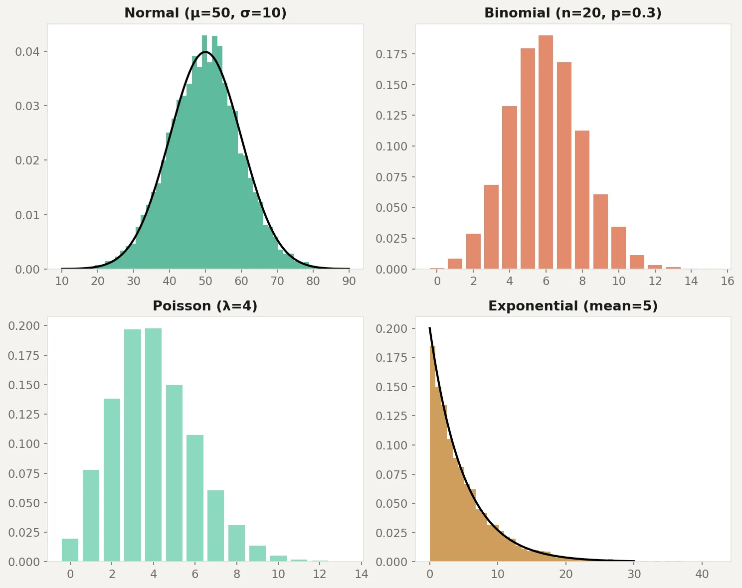
Here’s how to generate data from each distribution, visualize the shapes, and test whether real data matches an assumed distribution:
import numpy as np
import matplotlib.pyplot as plt
from scipy import stats

rng = np.random.default_rng(42)

fig, axes = plt.subplots(2, 2, figsize=(10, 8))

# Normal: symmetric, bell-shaped
normal_data = rng.normal(loc=50, scale=10, size=5000)
axes[0, 0].hist(normal_data, bins=50, density=True, alpha=0.7, color='steelblue')
x = np.linspace(10, 90, 200)
axes[0, 0].plot(x, stats.norm.pdf(x, 50, 10), 'k-', lw=2)
axes[0, 0].set_title('Normal (mu=50, sigma=10)')

# Binomial: discrete counts of successes
binom_data = rng.binomial(n=20, p=0.3, size=5000)
values, counts = np.unique(binom_data, return_counts=True)
axes[0, 1].bar(values, counts / counts.sum(), alpha=0.7, color='coral')
axes[0, 1].set_title('Binomial (n=20, p=0.3)')

# Poisson: count of rare events
poisson_data = rng.poisson(lam=4, size=5000)
values, counts = np.unique(poisson_data, return_counts=True)
axes[1, 0].bar(values, counts / counts.sum(), alpha=0.7, color='seagreen')
axes[1, 0].set_title('Poisson (lambda=4)')

# Exponential: time between events
exp_data = rng.exponential(scale=5, size=5000)
axes[1, 1].hist(exp_data, bins=50, density=True, alpha=0.7, color='goldenrod')
x = np.linspace(0, 30, 200)
axes[1, 1].plot(x, stats.expon.pdf(x, scale=5), 'k-', lw=2)
axes[1, 1].set_title('Exponential (mean=5)')

plt.tight_layout()
plt.savefig('distributions.png', dpi=150)
plt.show()

# Test: does this data look normal?
sample = rng.exponential(scale=5, size=100)
stat, p_value = stats.shapiro(sample)
print(f"Shapiro-Wilk test: stat={stat:.4f}, p={p_value:.4f}")
print(f"Conclusion: {'Looks normal' if p_value > 0.05 else 'Not normal'}")
The code generates 5,000 samples from each distribution and overlays the theoretical curve. The Shapiro-Wilk test at the bottom checks whether a sample looks normally distributed. In this case, exponential data fails the test decisively because it’s heavily right-skewed. One caveat: the Shapiro-Wilk test has low power on small samples (under 20 or so it may miss real non-normality) and is overly sensitive on large samples (above 5,000 it flags trivial deviations). A QQ-plot is often a better visual diagnostic for checking distributional fit.
Business application
E-commerce revenue. Customer spend is almost never normal. It’s right-skewed with a long tail: most people spend a little, a few spend a lot. Modeling this as normal underestimates the probability of high-value orders and gives you wrong confidence intervals. A log-normal or gamma distribution fits better.
Customer support tickets. Daily ticket counts often follow a Poisson distribution when the rate is stable. If your average is 12 tickets per day and you see 25 on a Monday, the Poisson tells you that’s a genuinely unusual event (p < 0.001), not just a bad day. But if tickets tend to cluster after outages, the Poisson assumption breaks and you need a model that handles overdispersion.
Conversion rates. Each visitor either converts or doesn’t, making this a binomial problem. Your A/B testing framework uses the binomial (or its normal approximation via CLT) to calculate whether the difference between variants is statistically significant. If conversion events aren’t independent (returning visitors, shared devices), the binomial assumptions fail and your p-values are too optimistic.
Time-to-event analysis. How long until a customer churns? How long between purchases? The exponential distribution is the starting point, but real customer behavior violates the memoryless assumption. Customers who survive the first 90 days are fundamentally different from those who don’t. Survival analysis models (Weibull, Cox) extend the exponential to handle this.
When NOT to assume a distribution. Don’t force a distribution onto data without checking. Plot the histogram. Run a goodness-of-fit test. Compare the observed mean and variance (for Poisson, they should be roughly equal). The most common mistake in applied analytics is treating everything as normal because it’s convenient. Convenience is not a statistical justification.